Which Test Won? Clarks Does it Again A/B Testing Navigation

We’ve written about how Clarks Shoes does a fair amount of testing to squeeze any little bit of response they can. This time they some A/B testing with a page that showed navigation if you scrolled up a long page vs. NO navigation. Thanks to the fine folks at Which Test Won, we know the answer!

Which do you think won?
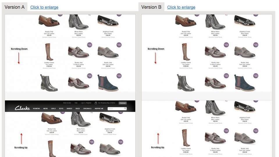
Screen Shot 2014-10-26 at 10.46.21 AM

Version A Won!

How did it do?

It increased orders by 2.16% at a 96.5% confidence level. and it increased ‘Add to Basket’ clicks by 1.27% at a 92% confidence level.

According to Which Test Won: “The test ran in two sequences over a 39-day period. There were four total variations. After three weeks, the team eliminated the two worst performing variations. Next, they ran a split test between the two top performing variations for the next 18 days.”

Great test guys, we’re always learnin’ from ya!

Google Analytics Segment Gallery: How To Use It

OK, a few days ago we discussed what a Google Analytics Segment is, and how to create one from scratch.

Today, we’re going to talk about another great way to create a segment, using the R&D (Rip-off & Duplicate;) method. OK, it’a not ‘ripping off’ anyone, it’s using Google’s segment and custom report gallery. The Google Analytics team as well as hundreds of expert contributors have made make their pre-built segments, custom reports and other handy solutions available. Pretty cool! We love the community aspect of this, and how it can really save time.

Here we go!

Go into the Admin tab of your Analytics account.

Click on ‘segments’ in the ‘personal tools and assets’ section. You’ll arrive at this page:
Screen Shot 2014-10-25 at 6.57.41 AM

Click on the ‘Import from Gallery’ button. You’ll arrive at the Solutions Gallery, click on ‘segments’ on the left hand side and you’ll see this:

The Google Analytics Segment Gallery

The Google Analytics Segment Gallery

We think Occam’s Razor is one of the best analytics blogs out there, and bingo! He also has the top-rated set of segments. So we’ll choose to import his collection. Once you select to import, you’ll select your analytics profile and which segments from his collection you want to import. And you’ll now see those in your Segment list:

Screen Shot 2014-10-19 at 10.17.27 AM

We selected ‘Loyal Visitors’ (3+ sessions) to add as a segment:
Screen Shot 2014-10-25 at 7.01.18 AMAnd voila! There ya go:

Screen Shot 2014-10-25 at 7.03.19 AM

We love the instant, additional insights these provide. In an upcoming post we’ll discuss some more uses of segments to help you understand, take action on and improve your results!

3 Effective Ways to Use Twitter Lists

Screen Shot 2014-10-25 at 1.20.13 PM

Dasheroo’s private list in Twitter.

We come from a direct marketing background with big businesses and small. So Twitter Lists are right in our wheelhouse. Why? Because we can sort through the clutter and organize directly who we want to hear from within each list.

Do we like Twitter Lists? Yes. Do we want them to do more? Yes. For instance a Twitter List is only a curated group of Twitter users and a great way to organize your interests. Can you Tweet a list? No. But we’re ok with that, for now.

Create a Twitter List:

Click on your Profile > Lists > Create a New List

Name your list, make it public or private. If you mark your list public, anyone can subscribe to it. If it’s private it’s for you to follow. Any time you follow someone you can add them to one or more lists. It’s super easy.

So here are 3 ways you can use Twitter Lists

  1. Follow Competitors - Create a list called “competition” mark it private and follow your competitors, their CEO and their employees. See how they’re using Twitter (Customer service, informational, etc.) and see if you can get any good ideas (or bad) from how they’re using it.
  2. Follow Influencers - If you know who is writing about your industry or your competition go ahead and follow them. Set up Google Alerts or use Buzzsumo to find out who cares about what you do, then follow them with an “influencer” list. You’ll be able to get a good view into what they’re posting about your industry and retweet them. If you do and they’re good social-media-ites, they’ll recognize it and follow you back!
  3. Follow VCs - If there are specific VC’s that fund companies in your industry you need to follow them and their partners. It’s good to see what they’re posting, what they’re interested in in the event you need funding at some point. You RT their Tweets and they may follow you back. BOOM! You hit their radar!

So create some Twitter lists and start to understand what’s going on in your industry!

Weekly Update: Salesforce Business Dashboards Launched!

We’re marching towards our Beta milestone in mid-November. We told you we were going to launch Salesforce Insights: DONE! We also told you we were going to work on resizing of your Insights and giving you custom date ranges. That’s next up on the developer to-do list.

Salesforce Insights Launched!Screen Shot 2014-10-23 at 2.01.23 PM

  • Leads by Source – View the top four sources generating new leads for your company.
  • Leads by Status – View the current status of your leads in a funnel or bar chart format.
  • Opportunities by Source – View the top four lead sources generating new opportunities for your company.
  • Opportunities by Stage – View your opportunity pipeline broken out by the different stages you’ve set up. See it in a funnel view or bar chart.

All of these Insights can be filtered using the exact list views that you’ve set up in Salesforce.

Other cool things we’re developing:

We’ve been working on something awesome, at least we think so. We’re giving more details into exactly what you’re looking at for each Insight and the metrics that are in them. Here’s a sneak peek:

business dashboards

Within each Insight you’ll be able to click on the metric and get a closer idea what you’re looking at with a rolling average of how you’re doing.

Users!

We had a great call with a user from Guadalajara (can never say that without thinking of Elvis) and we learned so much from it! Thanks guys you gave us a lot of great info: you want pie charts, a developer focus so you can create your own Insights and email alerts! Music to our ears.

SEO

We’ve been climbing nicely in search for the keyword “business dashboards”. We went from page 13 to page 6 perhaps with the with the Penguin update, who knows but we’re happy!

Gone Bloggin’

Google Analytics Segments: How To Set Them Up and Use Them, and How to Track Your Conversion Funnel. Pretty good and easy reads.

Fun Stuff!

Been knee-deep in getting a business license, drew architecture diagrams for investors, talked to potential new hires (we think we might have our first part-time QA person!) , opened up a bank account and getting business insurance.

Marching towards a pre-Thanksgiving beta release. We’ll have a ton to be thankful for!

Google’s Penguin 3.0 Release: What You Need to Know

Google is notorious for rolling out massive updates to its search algorithm and Penguin and Panda were probably the two that affected the widest group of websites. We’ve all been waiting for the next Penguin “upgrade” and Google began that process in the past few weeks.

If you recall, Penguin is an algorithm, launched in April of 2012, that tracks what Google thinks is “spam” and it penalizes websites by dragging them to the depths of the search queries. So if you had inbound links that you “paid for” on weird sites and directories, you may have been hit with this nasty change. Hey at one point everyone wanted more inbound links right?

And a ton of companies have been out there cleaning up their links, disavowing them, waiting for this change, while others stood still and did nothing. So most of the companies may have a positive outcome of the Penguin 3.0 change but those who are spammy offenders will notice a change, much to the negative.

For us here at our business dashboard startup Dasheroo, we’ve noticed a hugely positive change. We’re not sure if it’s because we’re producing content that our readers like to read or that those in front of us had such a negative impact from the alogorithm change that we jumped 6 pages! Who knows we’ll just keep doing what we’re doing and remain clean!

Here’s a great article by Moz to dig in deeper.

How To Track a Conversion Funnel

It doesn’t matter what business you’re in, whether you sell to consumers or you sell to businesses, whether it’s a product or a service, you should be looking at your conversion funnels.

A funnel chart starts at 100% and decrements at specific stages of the path that someone takes to consider you in their purchase decision.

So let’s look at a simple example from website visit to a sale:Screen Shot 2014-10-25 at 7.01.07 AM

You got 1000 visitors to you site. You know that because you’ve set up Google Analytics to look at that.

When they get to your site they are presented with a bunch of information about your products. 100 of them are somewhat interested so they click and submit their information for more info. That’s a 10% conversion rate from visitor to sign up.

You send them more info and you call them. You get in touch with 10 of them. That’s a 10% conversion rate from sign up to contact.

After the first contact you sell to 2 of them. That’s a 20% conversion rate from contact to close.

If your revenue from those sales covers the cost and time it took to close, great for you. If it doesn’t now is the time to start testing different parts of the funnel!

Hey, we just released Leads by Status and Opportunities by Stage Funnels for Salesforce. Check them out, it’s free!

New Release! Salesforce Business Dashboards

Screen Shot 2014-10-23 at 2.01.23 PMWe’ve been chatting you up about dipping our Dasheroo toes in the waters of Salesforce.com and that’s just what we did! So without further adieu here is what you now have access to:

  • Leads by Source - View the top four sources generating new leads for your company.
  • Leads by Status - View the current status of your leads in a funnel or bar chart format.
  • Opportunities by Source - View the top four lead sources generating new opportunities for your company.
  • Opportunities by Stage - View your opportunity pipeline broken out by the different stages you’ve set up. See it in a funnel view or bar chart.

All of these Insights can be filtered using the exact list views that you’ve set up in Salesforce.

Oh, our sneaky developers secretly included some optimizations in last night’s release in the hopes of decreasing the amount of time it takes for us to download and process stats. It worked! So your data should be speedier.

Exciting huh? Get on in there and connect your Salesforce account, check out your Salesforce business dashboards and let us know what you like and what you’d like to see since we’ll be releasing more!

Data Visualization: Comparing U.S. Population Segments

Thanks to the amazing folks at Flowingdata we’re always exposed to some great data visualizations. This one is awesome. Ben Blatt for Slate created this interactive masterpiece so you can compare the population density of different areas in the US. So if you click on New Jersey for instance, then click anywhere else on the map it’ll highlight a circular region with roughly the same population. What a great way to view how the US population is is distributed!

Not surprisingly the NY and Los Angeles rule it. But if you choose the Coasts and click on big square states insanity ensues!

Screen Shot 2014-10-18 at 10.37.22 AM